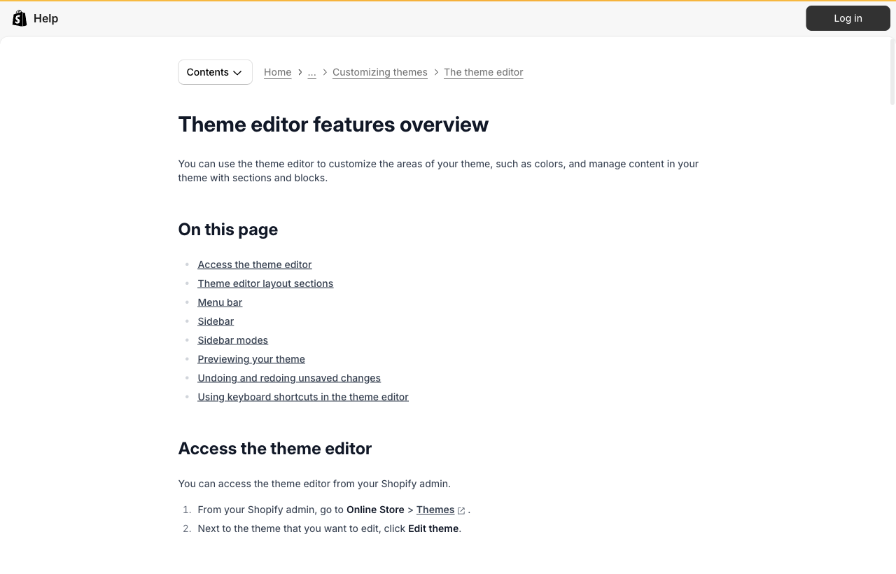
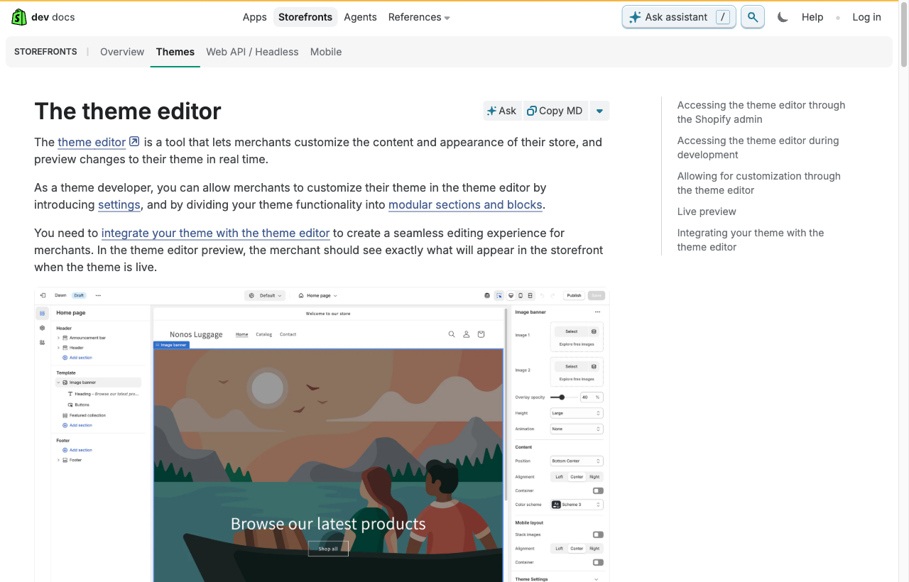
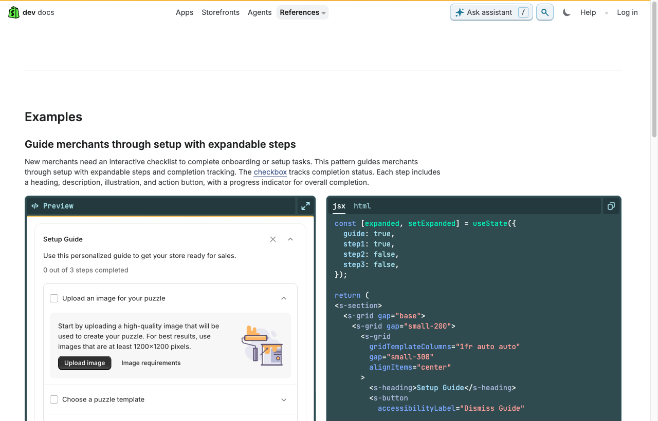
Shopify OS 2.0 theme editor Steal
Sections tree + sidebar toggling per-page vs global; conditional settings; double-sidebar at wide widths.
help.shopify.com/en/manual/online-store/themes/customizing-themes/theme-editor/features-overviewHow we approached the redesign: a live audit of the current Store Designer, benchmarked against the editors operators already trust, distilled into one governing idea, then traced back into every design decision.
We logged into the real Store Designer and captured its actual screens, catalogued the friction, then sourced a named, real-world reference for every problem from product docs, changelogs and design-system guidelines. Nothing here is opinion without a citation.
Abandon "one raw field per element". Instead: a small set of named brand tokens/roles that cascade, assigned to whole regions, edited by pointing at a live, click-to-edit preview, with presets as the starting point and progressive disclosure hiding the advanced controls. Every reference below is a variation on this.
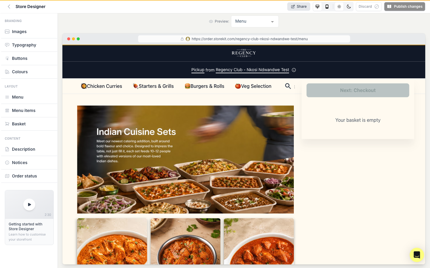
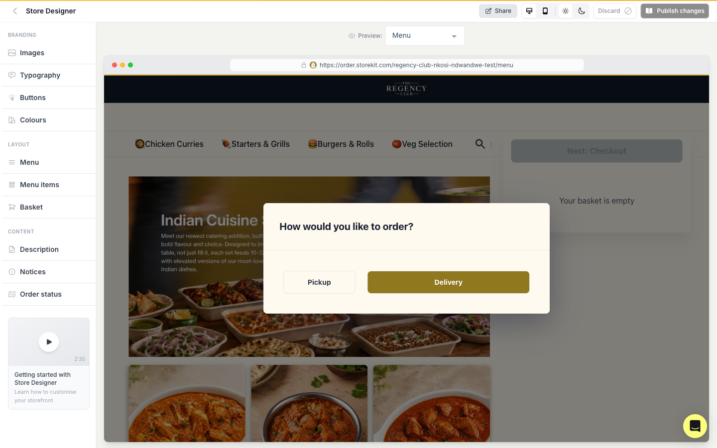
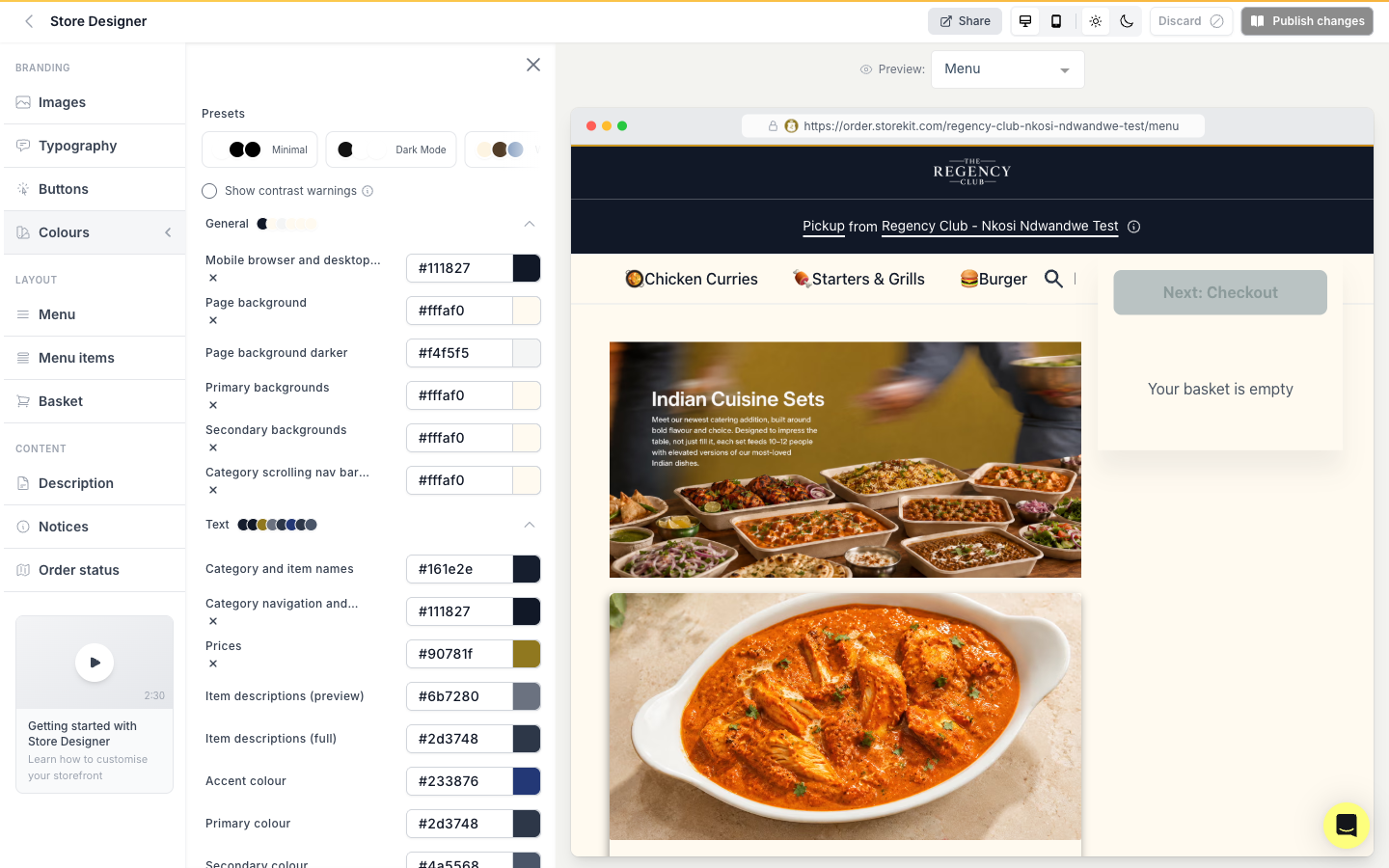
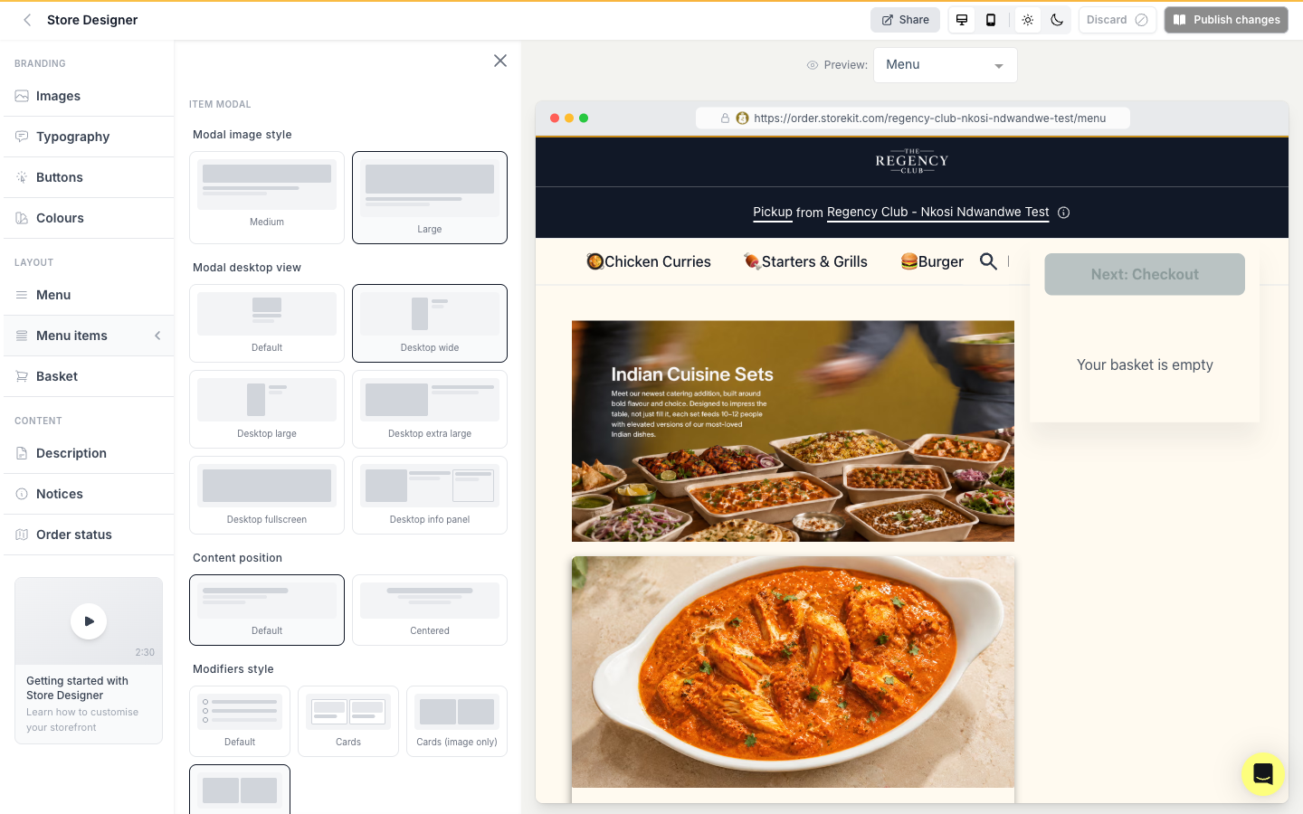
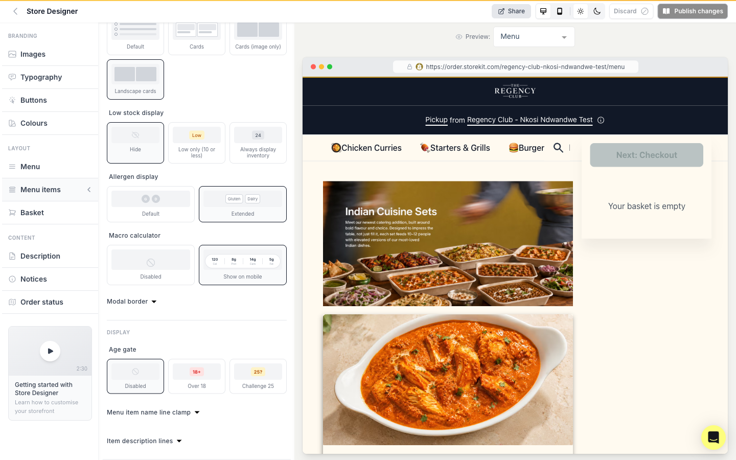
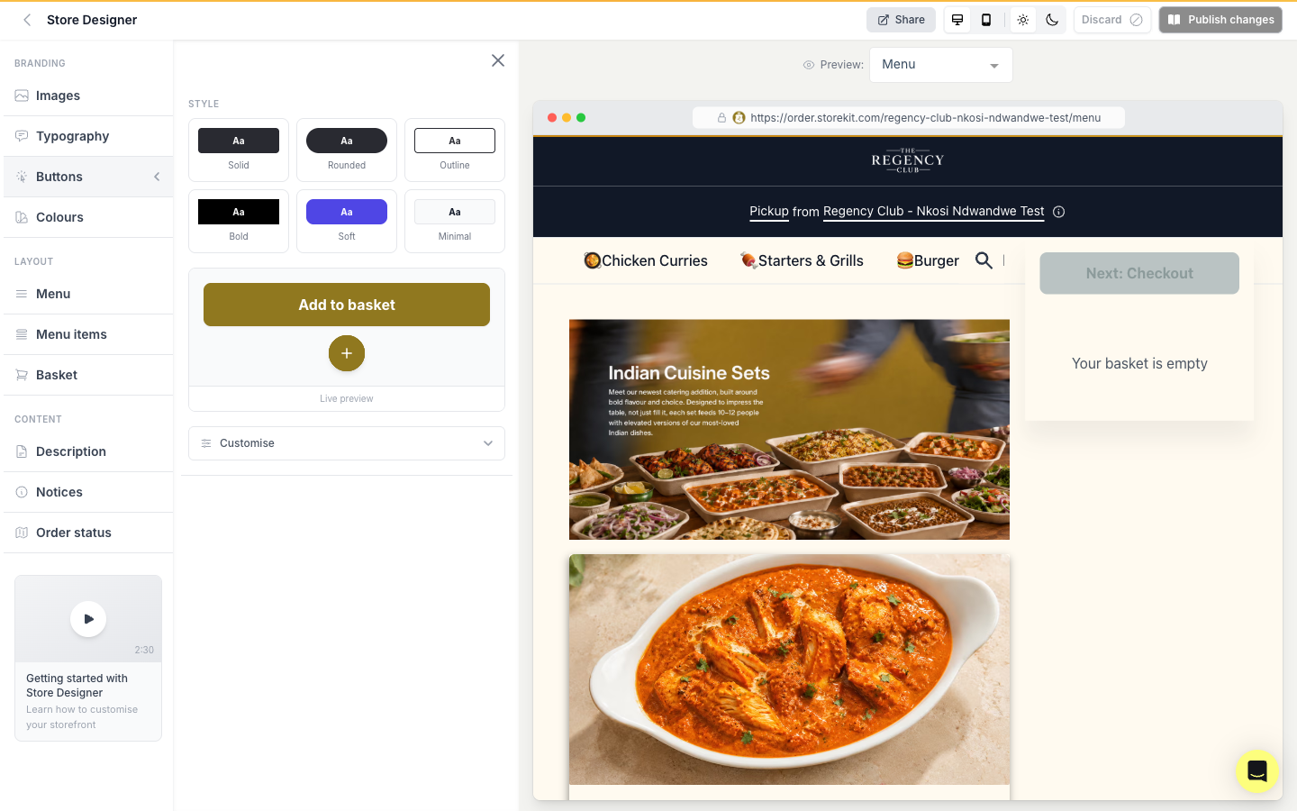
Our own captures of the current product. These are the screens the client asked us to improve, and the baseline every reference is measured against.
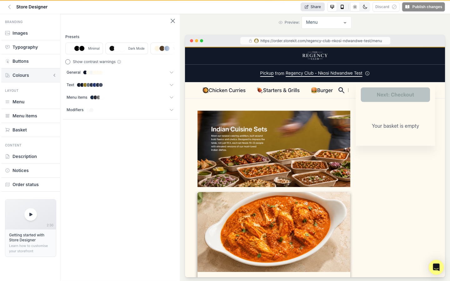
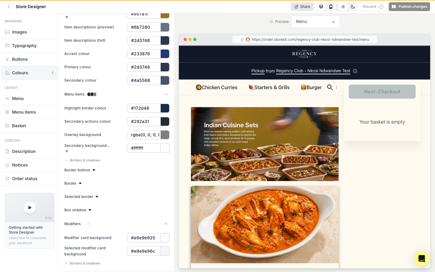
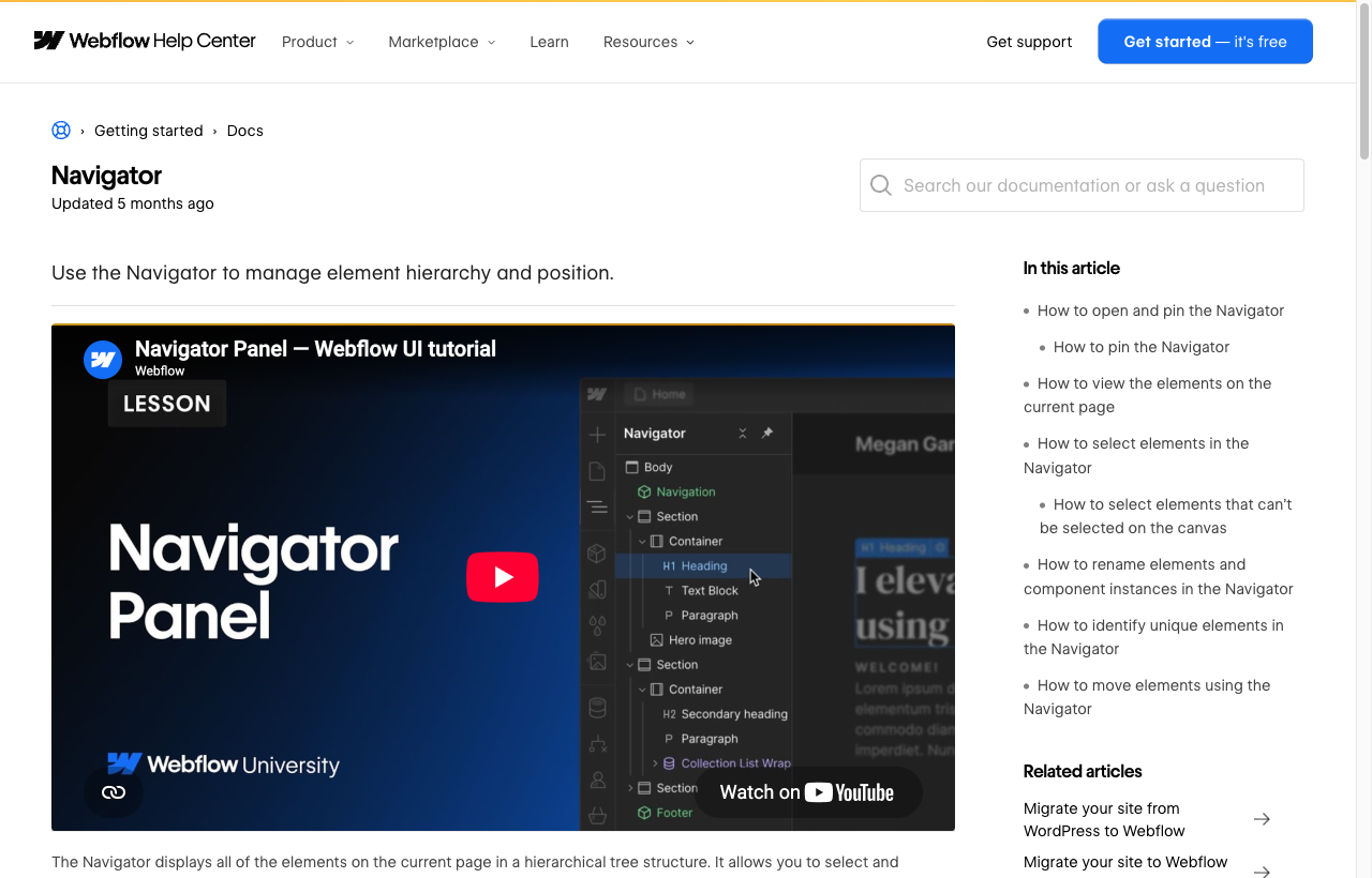
Grouped/scoped navigation, live-preview coupling, guided setup with progress, and a command palette.
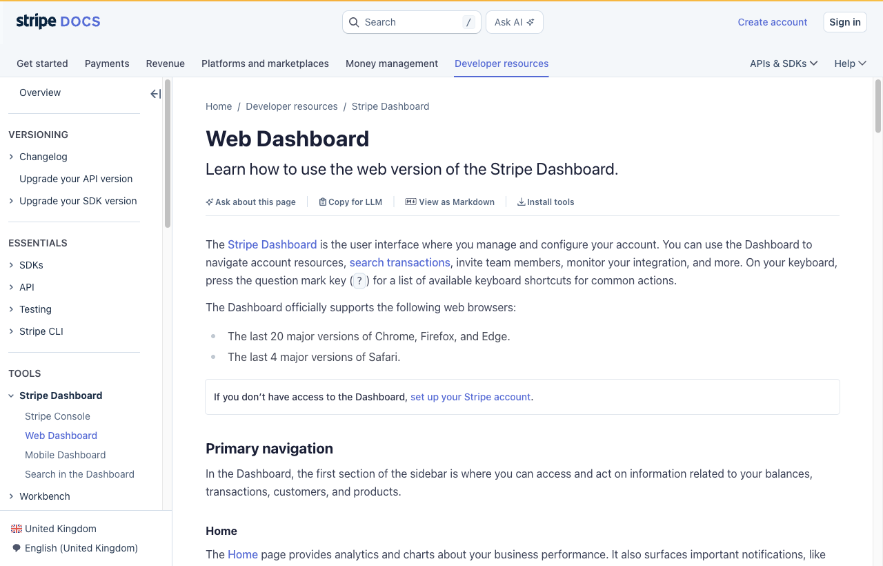
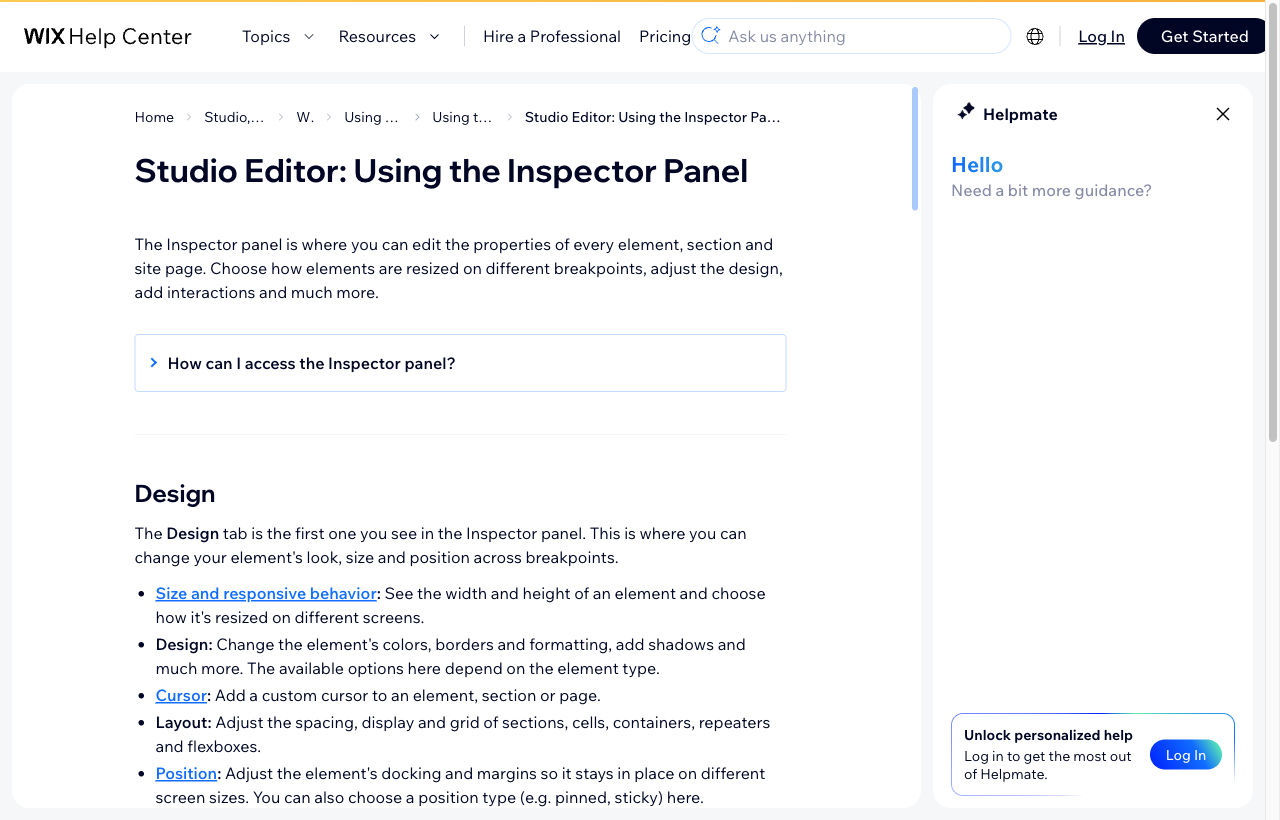



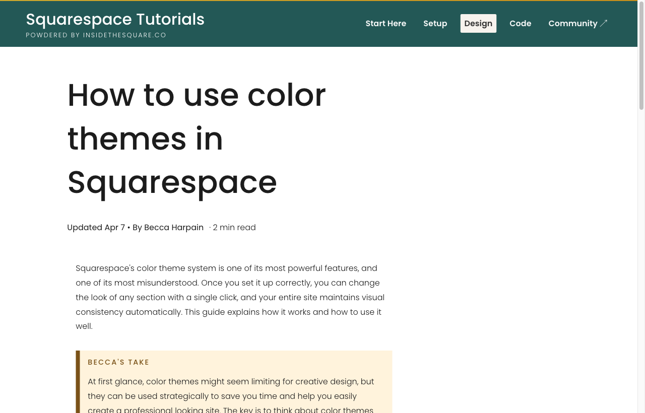
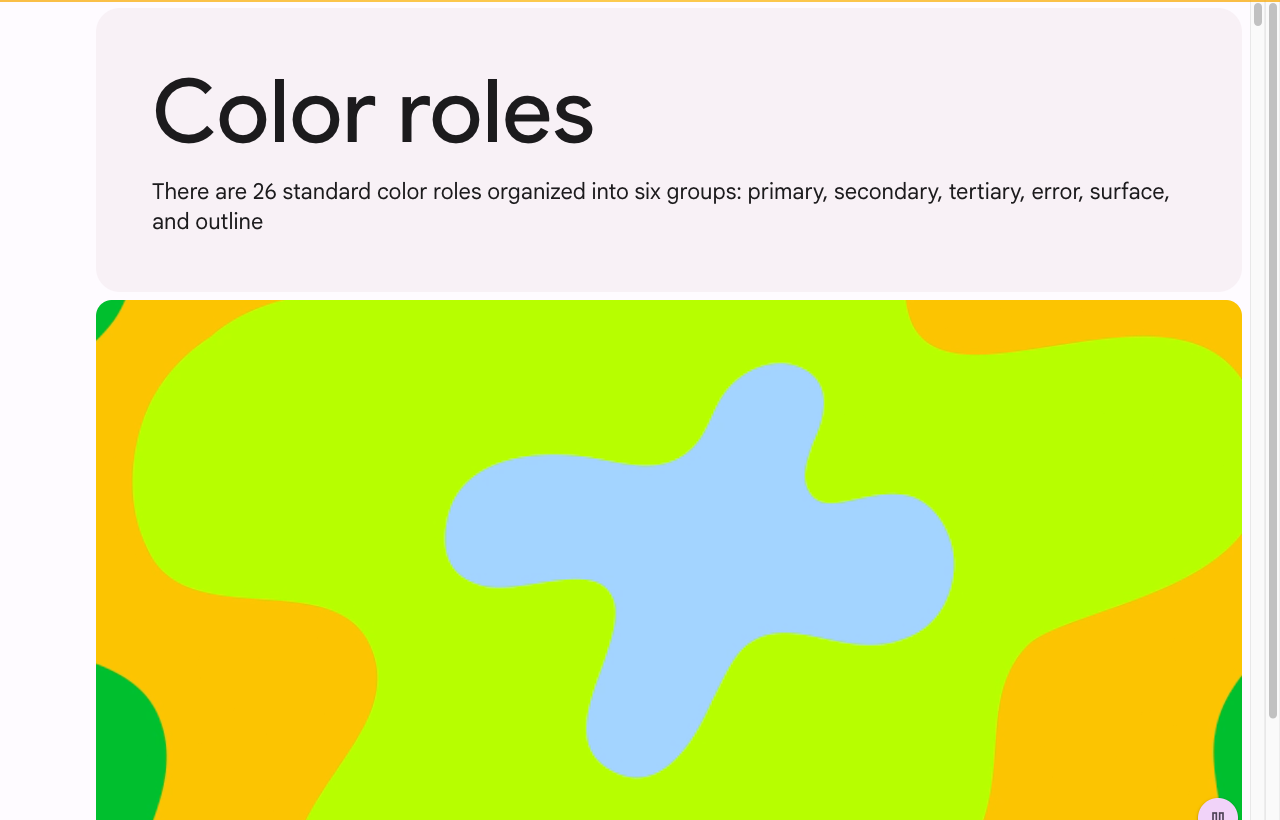
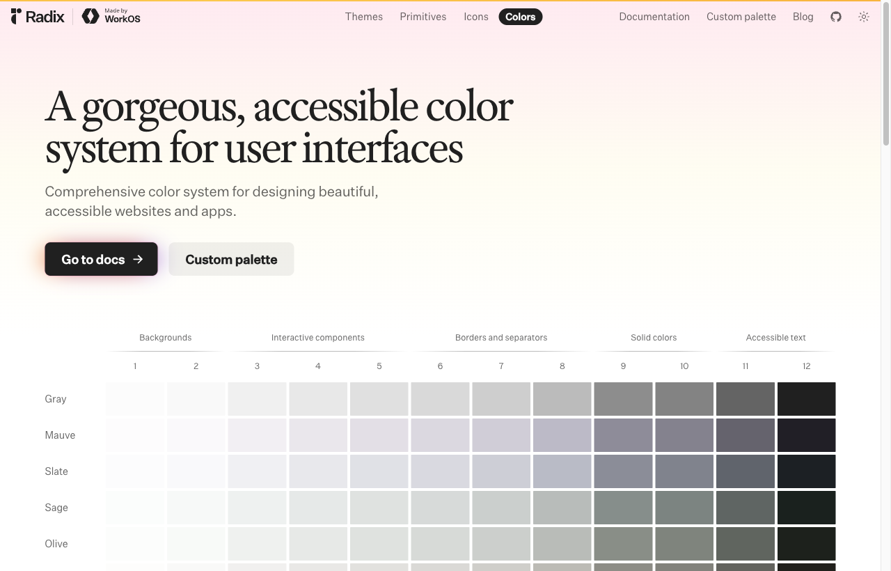
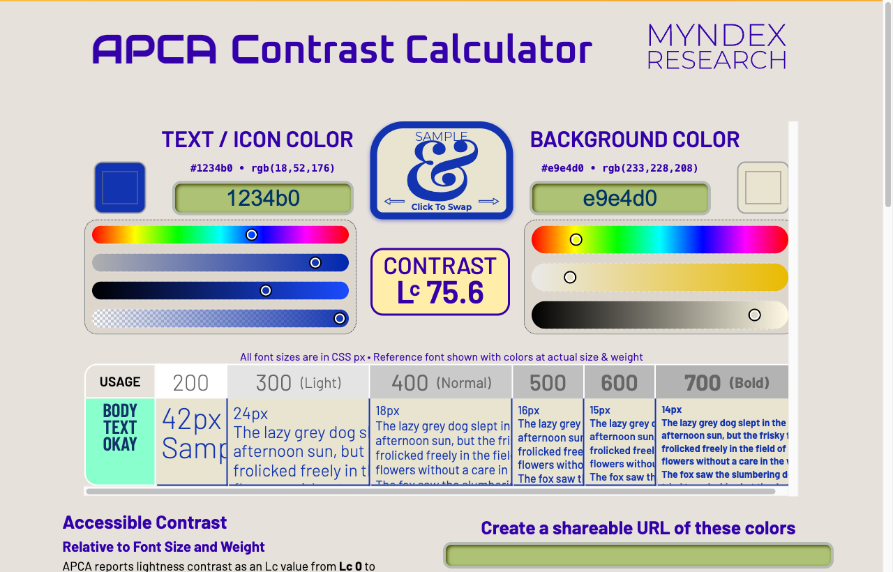
A small palette of roles that cascade, semantic tokens with light/dark, and point-at-the-storefront contrast fixing.
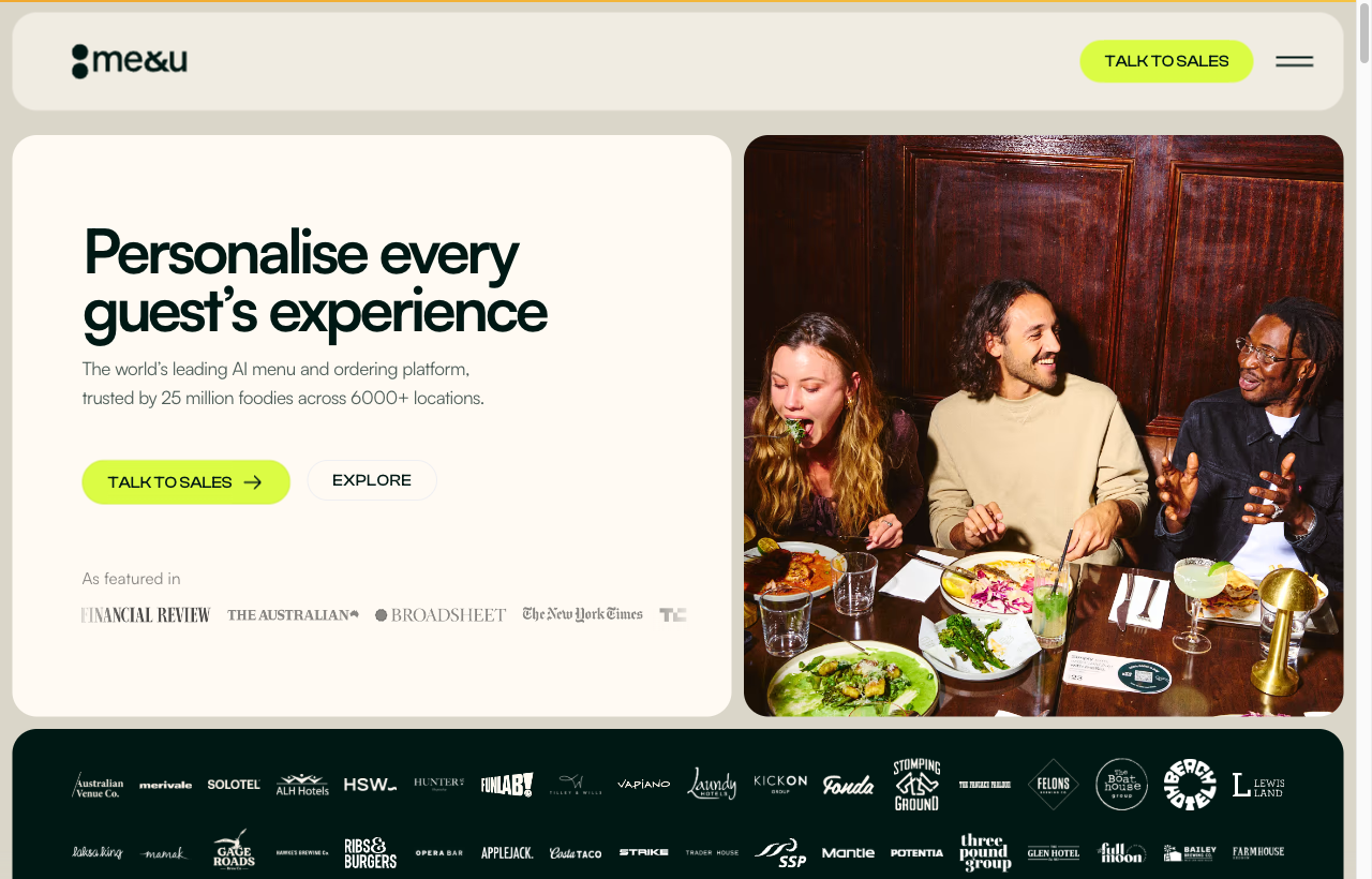
Edit the real dish popup with a live preview that updates as you style it; show each layout choice as a clear structural tile; and group the controls by purpose with the advanced ones tucked away.
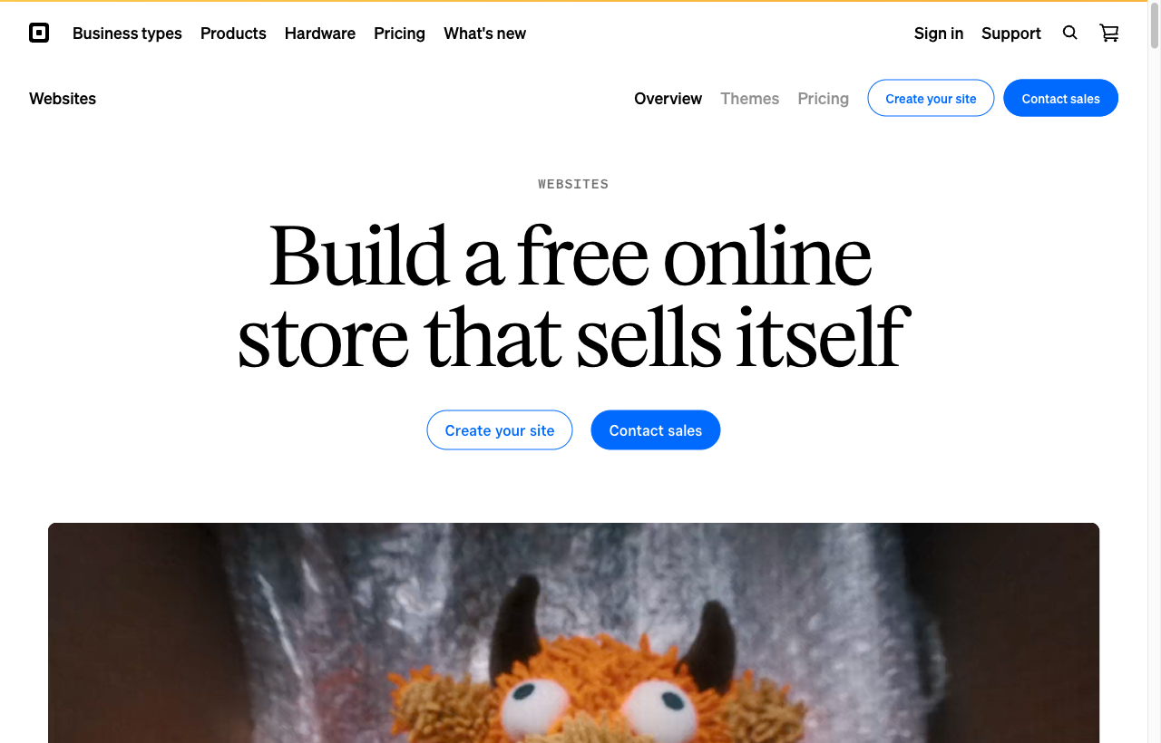
Where the direct competitors are strong (adopt) and where they leave gaps (our opportunity).
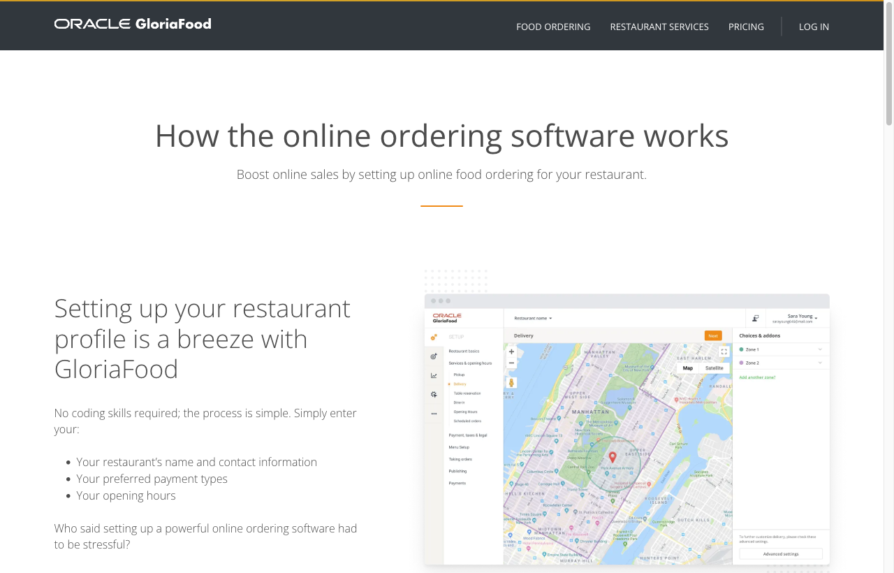
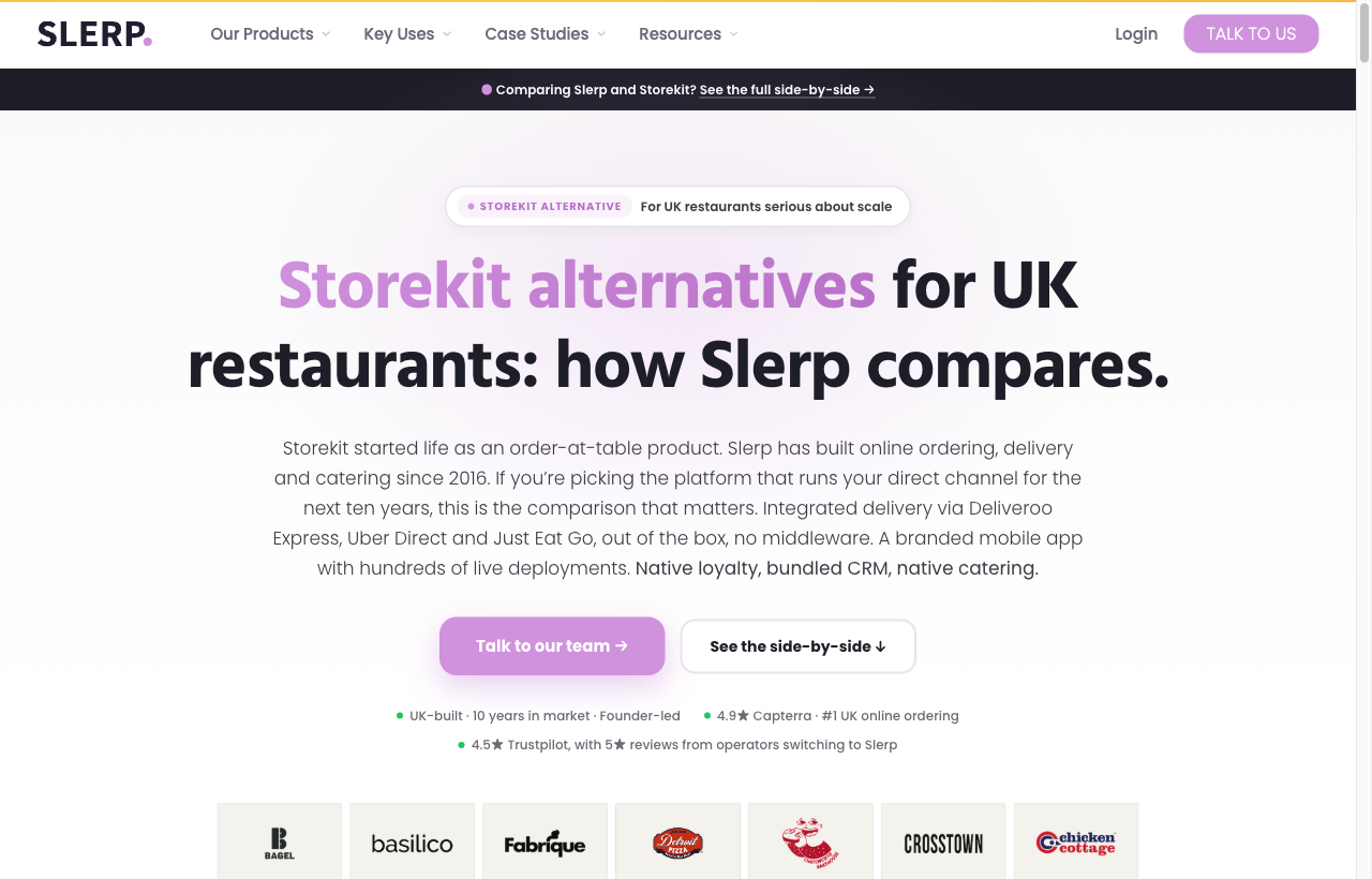
Where we mined live patterns, and the authorities we cite to justify each decision. Gallery sources are login-gated - referenced by URL, not scraped.
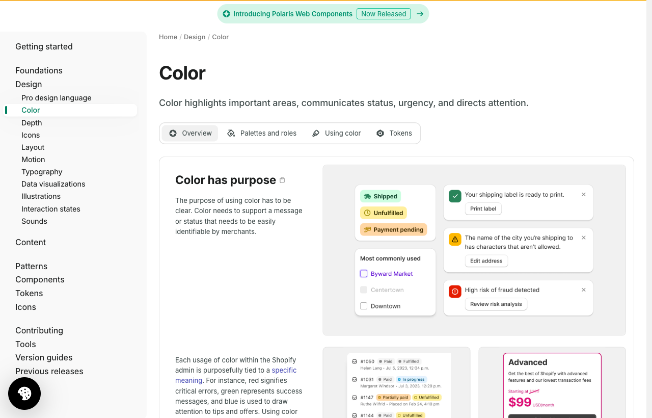

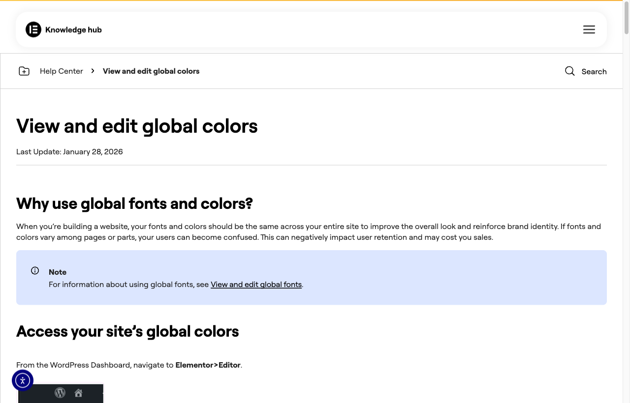
Every requirement in our design brief maps a live pain to a proven reference. This is the through-line of the presentation.
| Live pain (audit) | What we do | Proven by |
|---|---|---|
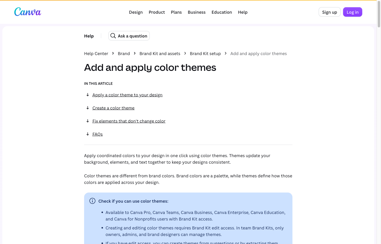
| 12 flat nav items, no start | Grouped nav + preset + import-brand + setup checklist with progress | Shopify Setup Guide, Stripe buckets, Canva Brand Kit, Duda logo-to-palette |
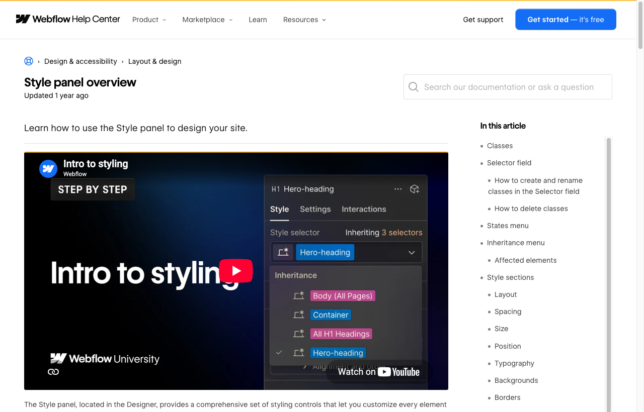
| Preview never shows what you edit | Two-way click-to-edit; preview binds to the open feature's surface | Shopify select-to-reveal, Squarespace, Webflow Navigator, Elementor |
| Can't find a control you can see | Always-visible search + Cmd-K palette over every setting | Linear / Notion / Vercel command palette |
| 30 raw colour fields | Named brand roles up top (Essentials) + a searchable Fine-tune area grouping every colour by where it appears | Squarespace themes, Material 3, Radix, shadcn, Webflow variables |
| Illegible text pairings | Inline contrast warning + one-click "fix text", brand colour untouched | APCA, CSS contrast-color(), shadcn foreground pairs |
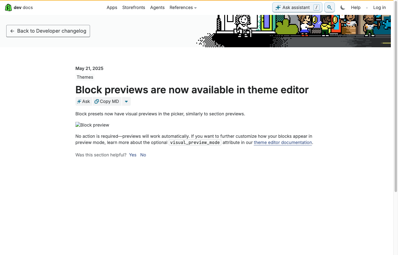
| Grey wireframe option tiles | Every option rendered as its real, populated result | Shopify block previews, Squarespace gallery, storekit Buttons panel |
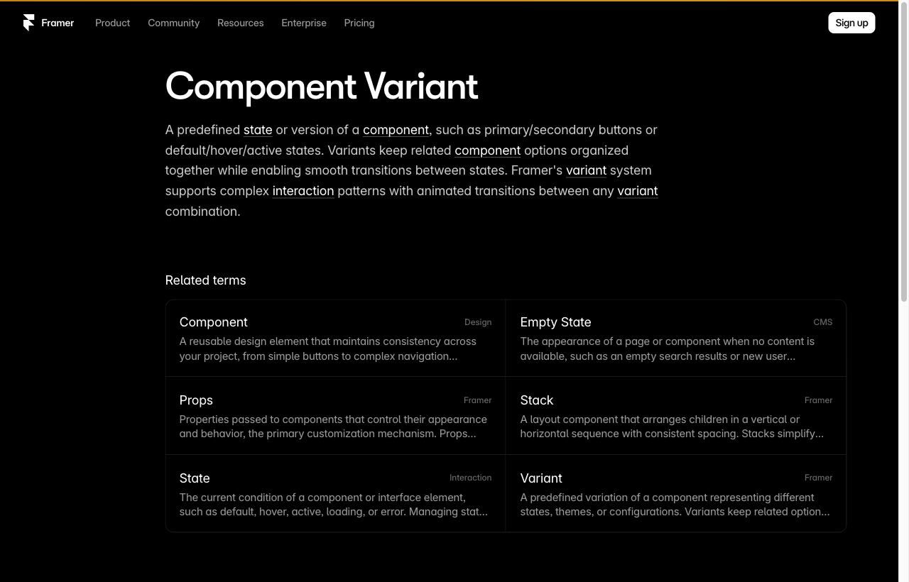
| Ambiguous look-alike layout tiles | Each layout is a clearly named tile that shows its shape at a glance | Framer variants, Klaviyo/Mailchimp layout choice |
| Mixed destructive + primary top bar | Regrouped top bar, two-axis save status, reconciled discard/revert | Shopify editor top bar, Elementor revisions, NN/g status |